Burning the midnight oil, the team at Coburn Creative works to bring a project to reality.
"When we're working with Barter Theatre, they're designing sets and costumes and dealing with content written by playwrights," Lee Coburn related. "They give us brief synopses of plays for the whole season, we read through copies of the plays, and then we participate in briefings and brainstorming sessions "in the round,' summarizing elements of the plays and focusing on key moments to capture the crux of the plays. They have ideas; we discuss them. We immerse ourselves in the goals of their productions, so the posters we design feel like the story and Barter's set designs. Our goal and Barter's goal is to give the audience a complete experience -- both before and after a performance. The posters give a lot of clues about what you're going to experience, plus there are hidden meanings that are revealed during and after the performance."
Barter Theatre Posters Deserve a Second Look
Coburn Creative staff members all come from painting and drawing backgrounds, so it comes as no surprise that they enjoy working on Barter Theatre posters. "It's more hands-on," remarked Amber Brown. "We make a conscious effort to get off the computer," interjected Jason Willis. "We go to the computer to polish and finish it," Coburn added.
What is surprising is how much time they spend taking photographs "on location" (outside the office), painting, designing, even carving -- literally creating works of art before the poster really gets underway.
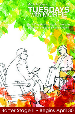
• For Barter's Tuesdays with Morrie poster, instead of creating leaves in Photoshop, the Coburn team carved leaves on potatoes and stamped leaf imprints on the artwork.
• For Wizard of Oz, they cut out paper dolls for a three-dimensional effect.
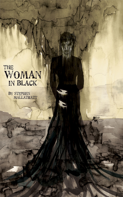
• For Woman in Black, they used a paintbrush dipped in India ink on vellum, and handmade parchment paper provided the foundation for the image.
• For The Blue-Sky Boys, Coburn's first draft focused on astronauts and depicted three characters flying through the air. "It had a "techie' or video game feel to it," Willis explained. "However, the story is about the engineers and the space program itself -- not just book-smart education, but also day-to-day observations that influence decisions, as well as visions and dreams (in the play, the engineers consult Galileo, Icarus, Snoopy, Buck Rogers, Apollo, and the Red Baron). We ended up building a rocket ourselves and sculpting it with different elements from the play: the wings of Icarus, Galileo looking through a telescope, and the Red Baron flying up the side. We also added crumpled paper to represent smoke from the rocket blasting off out of failed ideas."
• Last year, for Barter's Of Mice and Men, they photographed a barn in Emory, Va. and superimposed images on the structure. The sky included a bunny-shaped cloud; and a tree looked like it was losing its leaves -- both foreshadowing the death of Lenny, a mentally disabled migrant worker who dreams of retiring and tending to rabbits.
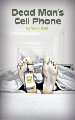
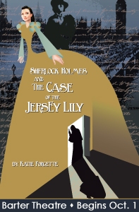
The Coburn team gets personally involved in the art -- literally. Brown said, "We often serve as models. I posed as "Jersey Lily' for the Sherlock Holmes poster. We used Jason's feet for Dead Man's Cell Phone, and he is the man seen in silhouette in the middle of a road for Where Trouble Sleeps."
• For Dead Man's Cell Phone, they borrowed a hospital room ("for realism") and photographed Willis's feet with a "toe tag" attached.
• For Where Trouble Sleeps, the Coburn team traveled to Chilhowie, Va., where they photographed Willis posing under two flashing yellow traffic lights in an intersection they thought would be relatively quiet at 9:30 p.m. on a "super-cold" November evening. "It's surprising how busy that little intersection was," recalled Willis. "We had to wait nearly two hours for traffic to die down long enough for us to shoot long-exposure for 30 seconds." When they returned to the computer, they still had to remove cars from the background and combine the two traffic lights into one.
At first glance, Barter Theatre posters are beautiful and attract attention, but they deserve an even closer look.
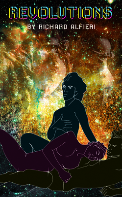
• For Revolutions, which has adult content, Amber said, "The material is pretty racy and edgy, so the poster needed to reflect some of that." The team selected images that would reflect the theme and "get the message across without using big warning labels -- like Mother Nature does with bright colors on the poisonous tree frog." The poster features three figures in the foreground and what looks like a starry sky. Look again and you'll see that the background includes different images representing the Kent State University riots, complete with soldiers in gas masks.
Not Re-inventing the Wheel
Peter Yonka said, "Unlike theatres that produce only one show at a time, Barter is a cineplex of theatre, presenting four plays in repertory as well as a children's production all at the same time. For the entire season, we have to "brand' at least 17 products, so the visual impact of our marketing materials is vitally important. Posters drive audiences to look at our season brochure and our website and to buy tickets. When you look at one of our posters, we want you to be able to determine if a play is "dark' or "light and happy' because there is no way to encapsulate a play in one paragraph or one photo."
Having lived in New York, Yonka has "seen a lot of theatre advertising. Major markets have been doing poster concepts -- where actors are not the "draw' -- using visual representations of the show instead," recalling how Broadway's Les Miserables was branded with the waif illustration.
In addition, the poster design has to translate to other printed materials as well as the web and television. "All pieces layer together to create a full experience," Yonka explained. "When we talk to the creative team, we tell them what we need from a marketing prospective. The artwork stands on its own but it also represents the vision of Barter's interpretation."
He continued, "Sometimes that's very simple. From a distance, our poster for The Diary of Anne Frank looks like a picture of a young girl. When you look more closely, you see lots of words that kept her alive and that she left behind."
Yonka added, "We produce an original poster for just about every play, except for shows like Annie. We don't need to re-invent the wheel when other people have already spent millions of dollars to create visuals that people are familiar with."
READ ON
-- Marketing the Arts: The Little House That Could